Inspector attributes
This core package includes custom attributes that change how a serialized field is drawn in the inspector, without writing a custom editor just for it.
Usage example:
using UnityEngine;
using SideXP.Core;

public class CustomAttributesExample : MonoBehaviour
{
    [Readonly] public string id;
    [EnableIf(nameof(useCooldown))] public float cooldown;
    [ProgressBar(0, 100)] public float health;
}
Readonly
Displays a field that is visible but not editable. Useful for debug values, generated ids, or data driven by other systems.

EnableIf and DisableIf
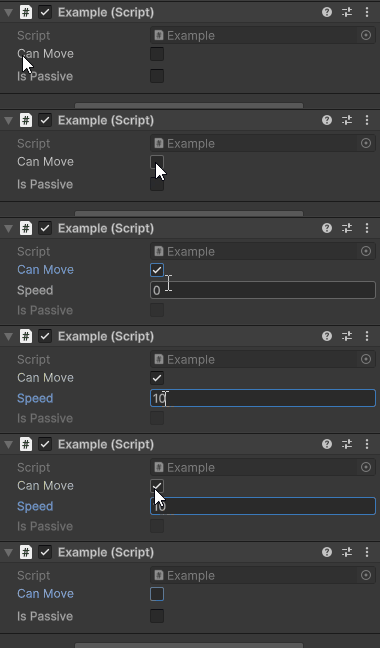
Enables (or disables) a field depending on the value of another boolean field or property on the same object. Set HideIfDisabled = true to hide the field entirely instead of greying it out.
public bool canMove;
[EnableIf(nameof(canMove), HideIfDisabled = true)] public float speed;
[DisableIf(nameof(canMove))] public bool isPassive;
ProgressBar
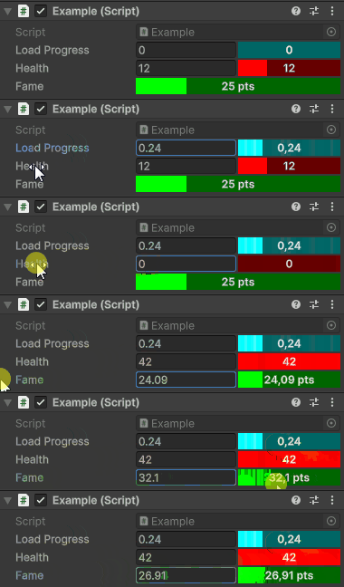
Draws a numeric field as a progress bar between a minimum and a maximum. Supports a color, a Prefix/Suffix, and Clamp/Readonly/Wide options.
[ProgressBar(0, 1)] public float loadProgress;
[ProgressBar(0, 42, FColor.Red, Clamp = true)] public int health;
[ProgressBar(0, 100, FColor.Green, Suffix = " MP", Wide = true)] public float fame;
Remap and Percents
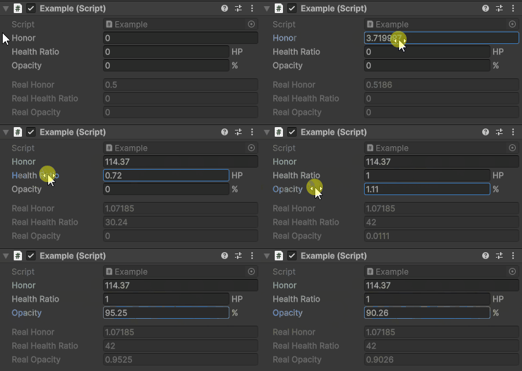
Remap lets you edit a value in one range while storing it in another. For example, edit 0–100 in the inspector but keep 0–1 in the data.
Percents is a ready-made specialization that displays a normalized 0–1 value as a 0–100 % field.
[Remap(-100, 100, 0, 1)] public float honor;
[Remap(FromMax = 1f, ToMax = 42f, Units = "HP", Clamped = true)] public float healthRatio;
[Percents(Clamped = true)] public float opacity;
Separator
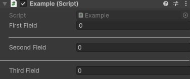
Draws a separator line before the field to visually group inspector sections. Enable Wide to span the full inspector width.
public int firstField;
[Separator]
public int secondField;
[Separator(Wide = true)]
public int thirdField;
Indent
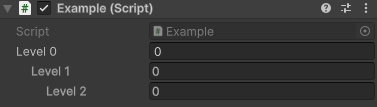
Indents the field by a number of levels, to visually nest it under a preceding field.
FolderPath
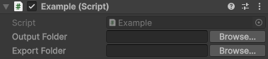
Turns a string field into a folder path picker with a "browse" button. By default it targets folders inside the project. Set AllowExternal = true to allow folders anywhere on disk.
[FolderPath] public string outputFolder;
[FolderPath("Select an export folder", allowExternal: true)] public string exportFolder;
AnimCurve
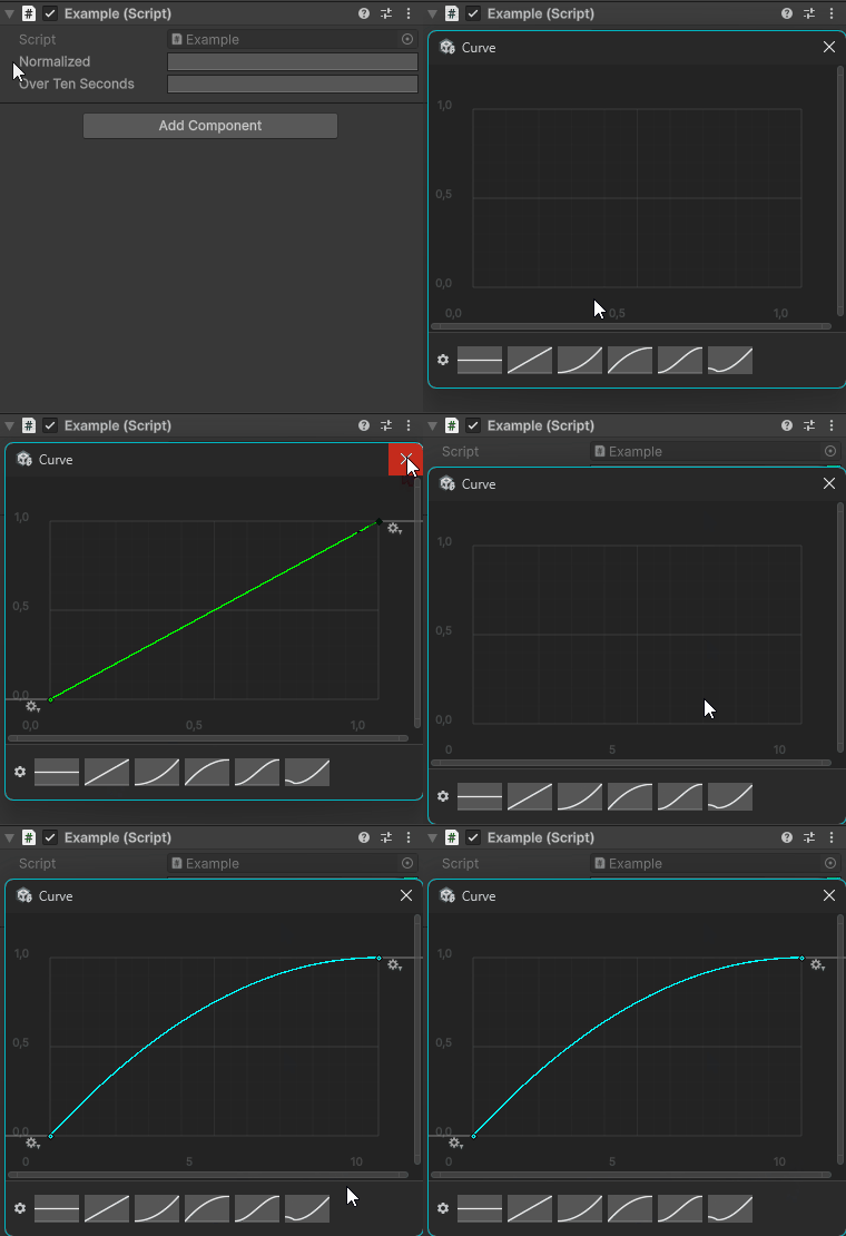
Frames an AnimationCurve field inside a fixed bounding box (min/max time and value) and tints the curve, so multiple curves stay visually consistent and comparable.
[AnimCurve(1, 1)] public AnimationCurve normalized;
[AnimCurve(0, 10, 0, 1, FColor.Cyan)] public AnimationCurve overTenSeconds;
Boolton
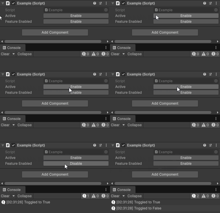
Displays a boolean as an enable/disable button instead of the default checkbox, and can invoke a callback (a method taking a single bool, or a boolean property setter) when toggled.
[Boolton] public bool active;
[Boolton(nameof(OnToggled))] public bool featureEnabled;

private void OnToggled(bool value) { Debug.Log("Toggled to " + value); }